One of the Hong Kong’s leading insurance company is transforming their customer facing platform by inventing a better way to make managing policy in a more easy and sufficient way. Together, we co-create a self service platform that allows customers to manage their policy easier, access self-service downloads, and allowing them to continue exploring for products that is recommended for them. The new customer website is expected to enhance customer satisfaction, reduce number of calls from the customer centre, improve revenue and ultimately increase the business’s valuation.
As the current site covers a large amount of content with more than a hundred of products, we need to understand the products, jargons, business lines and each of their business requirements and. To do this, we work closely with the product team to understand the underlying tech and process and design the UX and UI for the entire platform accordingly.
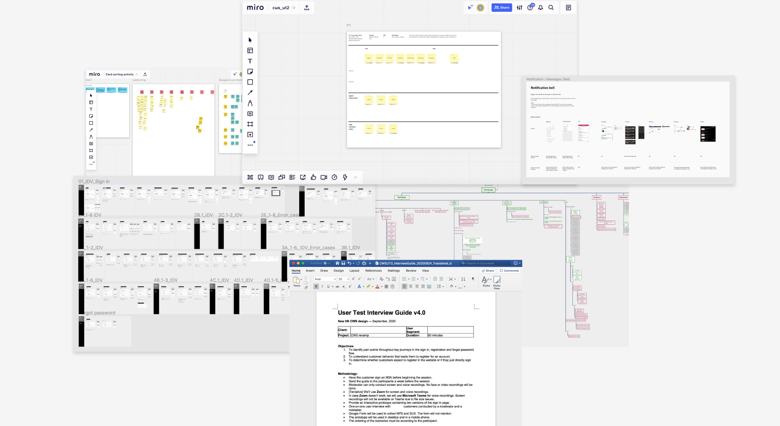
To know more about how the customer interact with the current platform, we asked staff (also customers) and friends to tell us pain-points and challenges that they are facing. We also asked them to arrange site content which allow us to sort out and prioritise relevant features and content based on a restructured information architecture. Most of the customers want to look at their policies coverage, value, gain/loss in order to make informed decision( e.g. switch funds, buy new policy).
We transferred our ideas into wireframes and created an interactive prototypes. We conducted two sessions of one-to-one usability tests with a wide range of customers to understand their behaviours that lead them to know about their needs, targets, current coverages and also to identify pain points and usability issues when going through key journeys within the new website design.
Leveraging our design thinking approach, the new site we built is a self service platform that is packed with useful features to optimise speed, accessibility, understanding, support and relevant recommendations. Fully responsive, the site’s design and functionality are tailored to all mobile and desktop device. The website was wrapped in a clean, intuitive card based design that was targeted at improving user focus, and offer up-to-date policy status and performances. As customers, it provides them with policies’ status and coverage, essential documents, eStatments, eClaims, activities record and fund performances.